Does WordPress Format Your Website For Different Devices?
Not so almighty
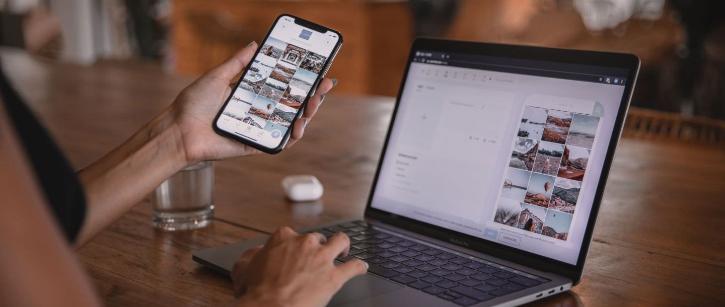
WordPress CMS is in essence a content management engine that generates content inserted by the content editor (website owner) to website visitors. The WordPress theme controls the website content formatting. When building your WordPress website, it comes with a default, pre-designed theme that was coded to comply with all device resolutions, thus creating the “automatic website formatting” phenomenon. Web designers, graphic designers and website layout designers often visualize customers’ ideas in one general graphic layout, leaving customers to believe it will serve all devices in the same way. That is a misconception when it comes to the fact how web browsing devices render websites and what are the commonly accepted web standards.
The Beasts
The most common devices used for website browsing are desktops (laptops), tablets and (smart)phones. Each of these devices has its own specifics that dictate how the website will be viewed by its user. In an ideal situation, a designer who creates a visual layout for a customer’s website is also familiar with WordPress. It will help to understand the WordPress theme formatting and rendering procedures, issues and also to avoid a misunderstanding of the development process. WordPress developers always appreciate working with the designs for all of the common devices. With all device designs they receive clear information as to how each of the devices will display the customer’s website once it is completed and installed on the hosting.
The Beauties
One of the most commonly used methods for designing websites considering all browsing devices is the “mobile first” approach. With that approach web designers create better experiences for users by starting the design process from the smallest of screens: mobile. Designing and prototyping your websites for mobile devices first helps you ensure that your users’ experience is seamless on any device.
The Goodies
A WordPress theme development and customization system allows the adoption of the “mobile first” approach and uses all of the benefits coming out of it. Website developers at Goodiewebsite are experts in WordPress development and use all of the principles of responsive web development to create website themes that are formatted nicely for all devices.
Still having doubts? Consider hiring a WordPess developer from Goodie Website. Get a non-obligatory consultation. Ready with your designs and would like to proceed with your project? To receive a free project quote with a turnaround estimate hit the button below.
About the author